No Products in the Cart


Last Updated: August 30, 2026
Building a cohesive home means creating visual and spatial harmony across your living spaces so that each room feels intentionally connected rather than randomly decorated. A cohesive interior requires a framework, a set of repeating visual elements that tie spaces together through materials, textures, colors, and styles.
Most homeowners lack intentionality rather than taste. You buy pieces you love one by one, and suddenly your home feels like separate moments rather than a continuous narrative. At Home 2 Court, we understand that cohesion isn't about rigid matching or expensive overhauls. It's about identifying your design vocabulary, the materials, colors, and finishes that will repeat throughout your home, and using those elements consistently. When you repeat a finish, a color undertone, or a texture across multiple rooms, your brain recognizes the pattern as intentional design.
This guide walks you through the practical steps to build a cohesive home, from defining your design theme to selecting the accent colors and materials that will anchor your spaces.
Your design theme is the overarching aesthetic that guides every decision. Without one, you're decorating in a vacuum. With one, every purchase becomes easier because you have a filter.
Start by identifying what draws you visually. Collect images from magazines, social media, and homes you've visited. Notice the patterns: Are spaces warm or cool? Do they use pattern or solid colors? Are finishes modern, traditional, or transitional? Your design theme doesn't need a fancy name, "warm and layered" works as well as "transitional farmhouse." What matters is specificity. "Modern" is too broad; "warm minimalism with natural materials and soft curves" gives you actual direction.
Once you've identified your theme, build the foundational layers: your color palette, material selections, and textures that will repeat across rooms. These elements create the visual thread that ties your home together.
Your color palette is the backbone of a cohesive home and the single most powerful tool for creating visual flow across rooms.
A neutral base doesn't mean everything is beige. Select one or two neutral tones that will dominate your walls, larger furniture pieces, and architectural details. This base creates visual rest and allows accent colors and textures to stand out.
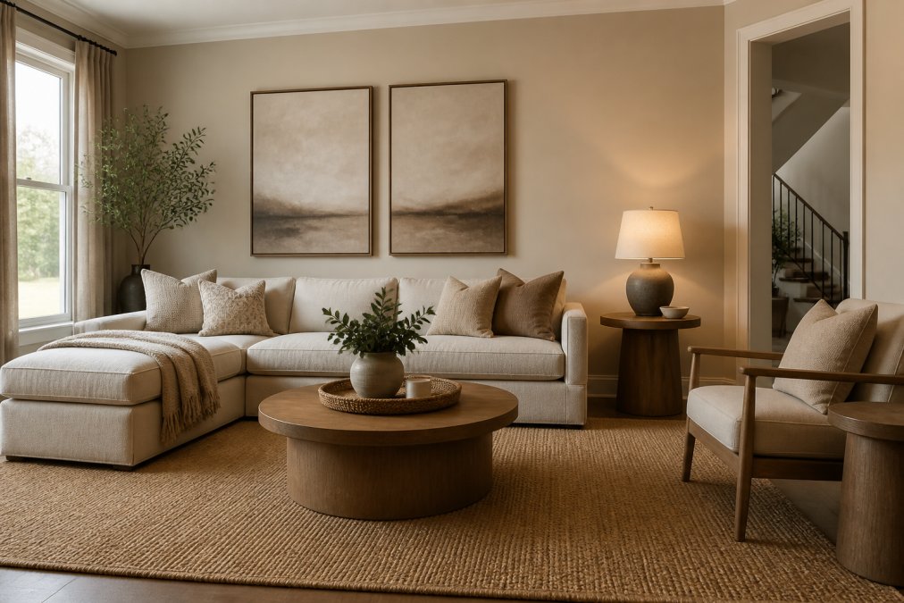
Choose a neutral with undertones that match your design theme. Warm neutrals (creams, warm grays, soft taupe) feel inviting and work beautifully with natural materials. Cool neutrals (crisp whites, cool grays) feel fresh and pair well with modern finishes. Repeat your chosen neutral across rooms to create immediate cohesion.
Many homeowners mistake using different neutral shades in different rooms, warm beige in the living room, cool gray in the bedroom, crisp white in the kitchen, which creates visual fragmentation. Instead, select one neutral tone or at most two that share the same undertone family, and use it as your foundation wall color and in larger furniture pieces. Your neutral base also appears in trim color, cabinetry, and flooring when possible.
Accent colors are where personality enters your cohesive home. Select two to three accent colors maximum and stick with them throughout. If your theme is warm and inviting, your accents might be soft sage green and warm terracotta. If your theme is cool and modern, your accents might be deep charcoal and dusty blue.
Repeat your accent colors across multiple rooms. A terracotta accent in your living room pillows should also show up in bedroom artwork and perhaps in a decorative piece in your entryway. This repetition creates visual continuity and signals deliberate choices. Apply the undertone consistency rule to accent colors too, if your sage green has blue undertones, ensure your terracotta has warm undertones, not cool ones.
Materials and finishes are the textures and surfaces that make a space feel real. When you repeat key materials across rooms, you create material repetition, one of the most powerful tools for building a cohesive interior.
Identify two to three primary materials that will anchor your design: natural wood, metal (brass, black iron, or stainless steel), and stone or ceramic. These materials should appear in multiple rooms and forms. Wood might show up as flooring, shelving, and picture frames. Brass might appear as light fixtures, hardware, and decorative objects.
Finish consistency matters as much as material itself. If your wood finish is warm honey tone, keep it consistent. If your metal is matte black, don't switch to polished chrome. These shifts create visual discord.
Architectural details often get overlooked but are powerful tools for material repetition. Trim color, baseboards, and door frames appear throughout your home. When you keep these consistent, you create an invisible thread that ties your home together.
You can absolutely mix furniture styles as long as you do it intentionally. The key is mixing through your design vocabulary, not random eclecticism. If your theme is warm and layered, pair a traditional wingback chair with a modern side table, as long as both pieces share your color palette, material choices, and overall mood.
Proportion and scale matter more than matching. A small modern accent chair next to a traditional sofa works because the pieces have visual balance. Repeat your material choices across different furniture styles. A mid-century modern credenza in walnut and brass speaks the same language as a traditional upholstered sofa with wooden legs.
Before purchasing furniture, ask: Does this piece share my color palette? Does it use my primary materials? Does it feel like it belongs in the same home as my other pieces? If the answer is no, it probably doesn't belong, no matter how much you love it individually.
Texture layering transforms a room from flat to rich and intentional. When you layer different textures, woven, smooth, rough, soft, you create visual interest and spatial depth without adding more color or pattern.
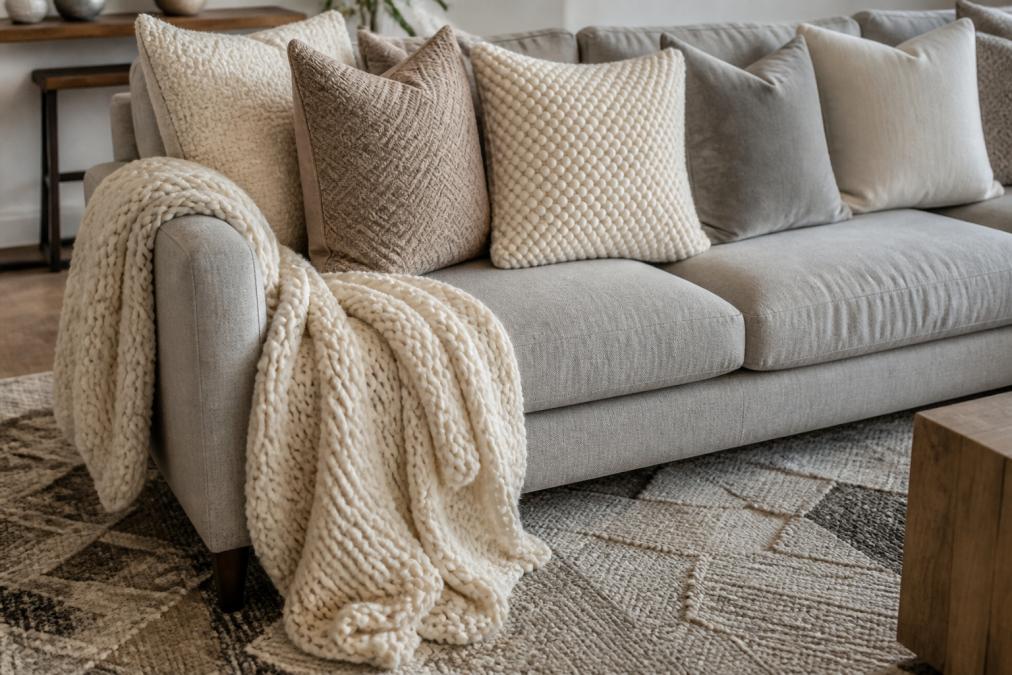
Start with base textures in your neutral foundation: smooth wall paint, natural wood floor, and soft linen sofa. Then layer in textures that add richness: woven jute rug, chunky knit throw, textured ceramic vessels, and linen pillows with subtle variations.
The key to successful texture layering is repetition. If you use chunky knit in your living room, bring that texture into your bedroom through a throw blanket or woven wall hanging. Textiles, rugs, curtains, throw pillows, blankets, are your primary texture tools. When you choose textiles in your color palette and with your primary materials (natural fibers like linen, wool, and cotton), they automatically support your cohesive design.
Transition spaces, hallways, entryways, and stairwells, are critical for building a cohesive home. These spaces are where your visitor moves from one room to another, and they're your opportunity to reinforce your design narrative.
Use transition spaces to repeat your color palette and materials. An entryway is perfect for introducing accent colors through artwork or a styled console table. A hallway can showcase your material choices through flooring, wall color, and lighting. Consistent lighting temperature (warm or cool) creates visual flow. If your living room has warm, layered lighting and your hallway switches to bright, cool-toned light, the shift breaks spatial harmony.
Architectural details in transition spaces matter too. Trim color, door frames, and baseboards should match the rest of your home. These details create the visual framework that ties everything together.
Once you've established your design framework, you're ready to fill in details with decorative pieces that reinforce your vision. When shopping online for home decor, use your design framework as your filter. Look for pieces in your color palette, made from your primary materials, and with textures that repeat throughout your home.
Home 2 Court offers a thoughtfully curated collection of home decor pieces designed to help you complete your cohesive vision. Rather than overwhelming you with infinite options, the curation means you're shopping from pieces already vetted for quality and aesthetic intentionality.
The psychology of space and how our environments influence wellbeing shows that intentional, cohesive environments reduce stress and increase satisfaction. This isn't just about aesthetics, it's about creating a sanctuary that supports your daily life.
Look for pieces that serve dual purposes: beauty and function. A decorative basket in natural material stores blankets while reinforcing your material vocabulary. A set of ceramic vessels in your accent color adds visual interest while providing practical storage.
Consider statement pieces that anchor a room within your design framework. A large ginger jar in white with subtle texture, like the White Textured Ginger Jar - Extra Large -8 Oak Lane from Home 2 Court, works as a focal point while staying true to your neutral base and texture layering approach. Scale matters when buying decor online, measure your space carefully and compare dimensions to furniture you already own.

Quality matters more than quantity. A few well-chosen pieces that fit your design framework create more cohesion than many pieces that don't. Read descriptions carefully to understand materials, finishes, and dimensions. Look for pieces made from your primary materials, natural wood, metal, ceramic, or stone, rather than synthetic alternatives.
Building a cohesive home is a process, not a single decision. Start with your design theme, establish your color palette and material choices, and then layer in textures and decorative pieces that reinforce your vision. Home 2 Court's curated collection helps you find pieces that complete your cohesive aesthetic without overwhelming you with endless options. Begin with one room, establish your design vocabulary there, and then expand that vocabulary into your other spaces. When you approach your home as a unified narrative rather than a collection of separate moments, every piece you add becomes part of a larger, intentional story.
=== FAQ ANSWERS (audit these too, same rules) ===
[1] Q: What is the 3-5-7 rule in decorating? A: The 3-5-7 rule is a design principle that helps create balanced visual weight in a room. Group items in odd numbers (3, 5, or 7) rather than even numbers to make arrangements feel more natural and intentional. For example, display three ginger jars on a shelf, five throw pillows on a sofa, or seven decorative objects across a console table. This approach prevents spaces from feeling too symmetrical or rigid, making your cohesive home feel thoughtfully curated rather than randomly assembled.
[2] Q: How do you create flow between rooms with different styles? A: Create flow by using transition spaces, hallways, doorways, and entryways, as design bridges. Repeat one or two key materials, colors, or finishes from each adjacent room in the transition zone. For instance, if your living room features blue chinoiserie accents and your bedroom uses warm neutrals, place a Blue Chinoiserie Cachepot Small or Blue Chinoiserie Candlestick Set - Lg - 8 Oak Lane in the hallway connecting them. This design thread guides the eye smoothly from space to space and prevents jarring style shifts that make a home feel disjointed.

[3] Q: What color palettes make a house look cohesive? A: Cohesive color palettes typically use a neutral base (white, beige, gray, or soft taupe) with 2-3 accent colors repeated throughout. Choose colors with complementary undertones, cool whites paired with cool grays and blues, or warm whites paired with warm grays and terracottas. Limit accent colors to high-impact areas like artwork, textiles, and statement pieces. This restraint creates spatial harmony without monotony. A White Textured Ginger Jar - Extra Large -8 Oak Lane, for example, anchors a neutral base while Blue Chinoiserie Ginger Jar - Large pieces introduce a consistent accent color across rooms.

[4] Q: What makes a home look cheap versus expensive? A: Expensive-looking homes balance quality with intention. Invest in a few standout pieces with finish consistency, like a handcrafted ginger jar, rather than filling spaces with many low-cost items. Repeat materials thoughtfully: if you use brass fixtures in one room, carry that finish into others. Avoid clutter and ensure each piece serves a purpose in your design narrative. Affordable homes often feel disjointed because they lack material repetition and architectural details. Curated, cohesive selections signal intentionality and taste, even when budget is modest.
[5] Q: How can I mix textures to make a home feel unified? A: Texture layering creates visual interest while maintaining cohesion. Start with a base texture (smooth walls, polished wood), then add mid-range textures (woven baskets, linen textiles), and finish with tactile accents (knit throws, rough ceramics). Keep textures within the same color family to avoid visual chaos. A White Textured Ginger Jar - Extra Large -8 Oak Lane pairs naturally with a linen sofa, a jute rug, and soft cotton throw pillows. This approach builds depth and sophistication while the unified color palette keeps everything feeling intentional and connected.
[6] Q: What are common mistakes that make a home look disjointed? A: The biggest mistakes are inconsistent finishes, mismatched undertones, and unplanned transitions between rooms. Mixing warm and cool metals without intention, using too many unrelated accent colors, and neglecting hallways and entryways break visual flow. Another error is ignoring scale, oversized furniture in small rooms or tiny accents in large spaces disrupts spatial harmony. Avoid buying pieces purely for function without considering how they fit your design theme. Finally, failing to repeat key materials and colors across rooms creates a scattered, unfocused aesthetic rather than a unified interior.
[7] Q: How do I know if decor will match my home's style before ordering online? A: Start by defining your design theme and mood board before shopping. Photograph your existing furniture, paint colors, and finishes, then use those as reference when browsing. Look for pieces with consistent undertones and materials that echo what you already own. Home 2 Court's curated selection is organized by aesthetic, chinoiserie, coastal, modern, making it easier to find items that align with your vision. Read product descriptions carefully for material details and dimensions. If unsure, order one statement piece first to test how it photographs and feels in your space before committing to larger purchases.
[8] Q: Can I build a cohesive home on a tight budget? A: Yes. Focus on a strong neutral base using affordable paint and basic furniture, then invest in 3-5 standout pieces that define your design theme. A single handcrafted ginger jar or Chinoiserie Cachepot Small becomes a focal point that anchors the entire room. Repeat this piece's color or style in smaller, cheaper accents like throw pillows or artwork. Thrift or buy secondhand for furniture, then unify it with consistent paint colors and textiles. The key is intentionality over quantity, fewer, well-chosen pieces create cohesion far better than many random items.
The 3-5-7 rule is a design principle that helps create balanced visual weight in a room. Group items in odd numbers (3, 5, or 7) rather than even numbers to make arrangements feel more natural and intentional. For example, display three ginger jars on a shelf, five throw pillows on a sofa, or seven decorative objects across a console table. This approach prevents spaces from feeling too symmetrical or rigid, making your cohesive home feel thoughtfully curated rather than randomly assembled.
Create flow by using transition spaces, hallways, doorways, and entryways, as design bridges. Repeat one or two key materials, colors, or finishes from each adjacent room in the transition zone. For instance, if your living room features blue chinoiserie accents and your bedroom uses warm neutrals, place a [Blue Chinoiserie Cachepot Small](https://home2court.myshopify.com/products/chinoiserie-cachepot-small) or [Blue Chinoiserie Candlestick Set - Lg - 8 Oak Lane](https://home2court.myshopify.com/products/blue-chinoiserie-candlestick-set-lg-8-oak-lane) in the hallway connecting them. This design thread guides the eye smoothly from space to space and prevents jarring style shifts that make a home feel disjointed.
Cohesive color palettes typically use a neutral base (white, beige, gray, or soft taupe) with 2-3 accent colors repeated throughout. Choose colors with complementary undertones, cool whites paired with cool grays and blues, or warm whites paired with warm grays and terracottas. Limit accent colors to high-impact areas like artwork, textiles, and statement pieces. This restraint creates spatial harmony without monotony. A [White Textured Ginger Jar - Extra Large -8 Oak Lane](https://home2court.myshopify.com/products/white-textured-ginger-jar-extra-large-8-oak-lane), for example, anchors a neutral base while [Blue Chinoiserie Ginger Jar - Large](https://home2court.myshopify.com/products/blue-chinoiserie-ginger-jar-large) pieces introduce a consistent accent color across rooms.
Expensive-looking homes balance quality with intention. Invest in a few standout pieces with finish consistency, like a handcrafted ginger jar, rather than filling spaces with many low-cost items. Repeat materials thoughtfully: if you use brass fixtures in one room, carry that finish into others. Avoid clutter and ensure each piece serves a purpose in your design narrative. Affordable homes often feel disjointed because they lack material repetition and architectural details. Curated, cohesive selections signal intentionality and taste, even when budget is modest.
Texture layering creates visual interest while maintaining cohesion. Start with a base texture (smooth walls, polished wood), then add mid-range textures (woven baskets, linen textiles), and finish with tactile accents (knit throws, rough ceramics). Keep textures within the same color family to avoid visual chaos. A [White Textured Ginger Jar - Extra Large -8 Oak Lane](https://home2court.myshopify.com/products/white-textured-ginger-jar-extra-large-8-oak-lane) pairs naturally with a linen sofa, a jute rug, and soft cotton throw pillows. This approach builds depth and sophistication while the unified color palette keeps everything feeling intentional and connected.
The biggest mistakes are inconsistent finishes, mismatched undertones, and unplanned transitions between rooms. Mixing warm and cool metals without intention, using too many unrelated accent colors, and neglecting hallways and entryways break visual flow. Another error is ignoring scale, oversized furniture in small rooms or tiny accents in large spaces disrupts spatial harmony. Avoid buying pieces purely for function without considering how they fit your design theme. Finally, failing to repeat key materials and colors across rooms creates a scattered, unfocused aesthetic rather than a unified interior.
Start by defining your design theme and mood board before shopping. Photograph your existing furniture, paint colors, and finishes, then use those as reference when browsing. Look for pieces with consistent undertones and materials that echo what you already own. Home 2 Court's curated selection is organized by aesthetic, chinoiserie, coastal, modern, making it easier to find items that align with your vision. Read product descriptions carefully for material details and dimensions. If unsure, order one statement piece first to test how it photographs and feels in your space before committing to larger purchases.
Yes. Focus on a strong neutral base using affordable paint and basic furniture, then invest in 3-5 standout pieces that define your design theme. A single handcrafted ginger jar or [Chinoiserie Cachepot Small](https://home2court.myshopify.com/products/chinoiserie-cachepot-small) becomes a focal point that anchors the entire room. Repeat this piece's color or style in smaller, cheaper accents like throw pillows or artwork. Thrift or buy secondhand for furniture, then unify it with consistent paint colors and textiles. The key is intentionality over quantity, fewer, well-chosen pieces create cohesion far better than many random items.
This article was written using GrandRanker
